La meraviglia for God is Green
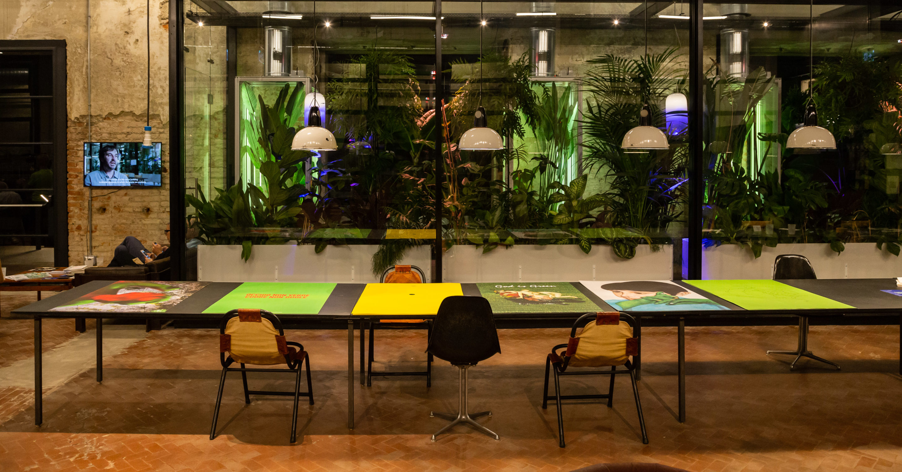
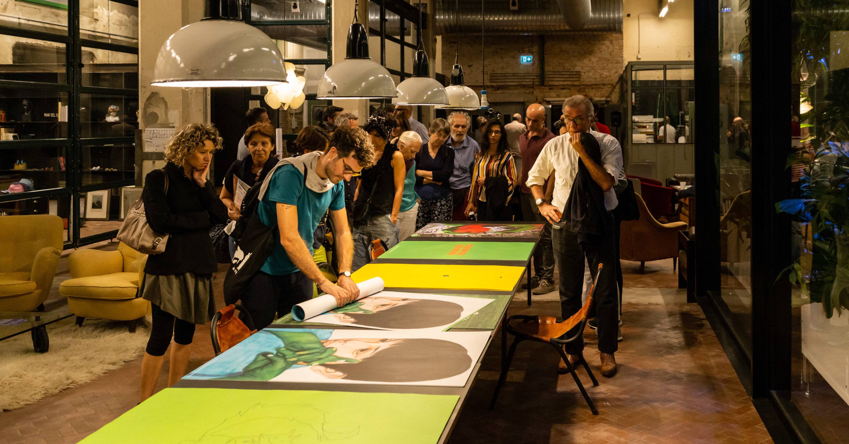
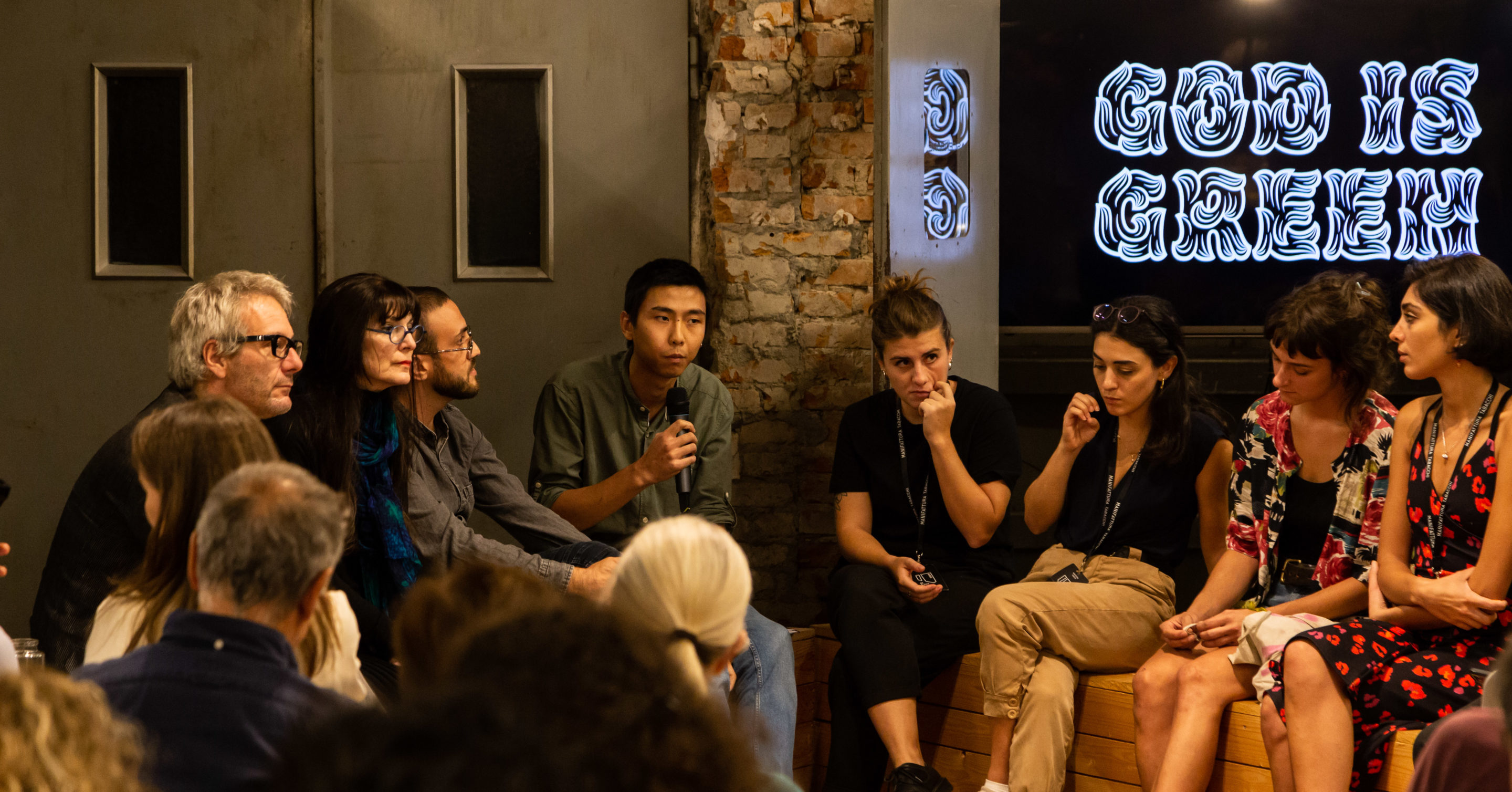
A starting point, a simple word that is so rich in history and meaning, ‘green’. The artists from the second Art residence La meraviglia arrived at Manifattura Tabacchi only two weeks ago, but they have already been involved in six projects, producing six posters, all different, all with the same point of departure: the festival God is Green. Green is not just a colour, not just the shade amongst the countless variants in nature that oxygenates the planet, it is so much beyond that, an ‘otherness’ that can perhaps only be seen through the eyes of an artist, looking beneath the apparent superficiality of things. And it is precisely this that will take place within the B8, a space dedicated to art inside Manifattura Tabacchi: breaking down mental, social and cultural walls.
sons of green
davide d'amelio
2019
stampa offset su carta, ed. 150, cm 70 x 100

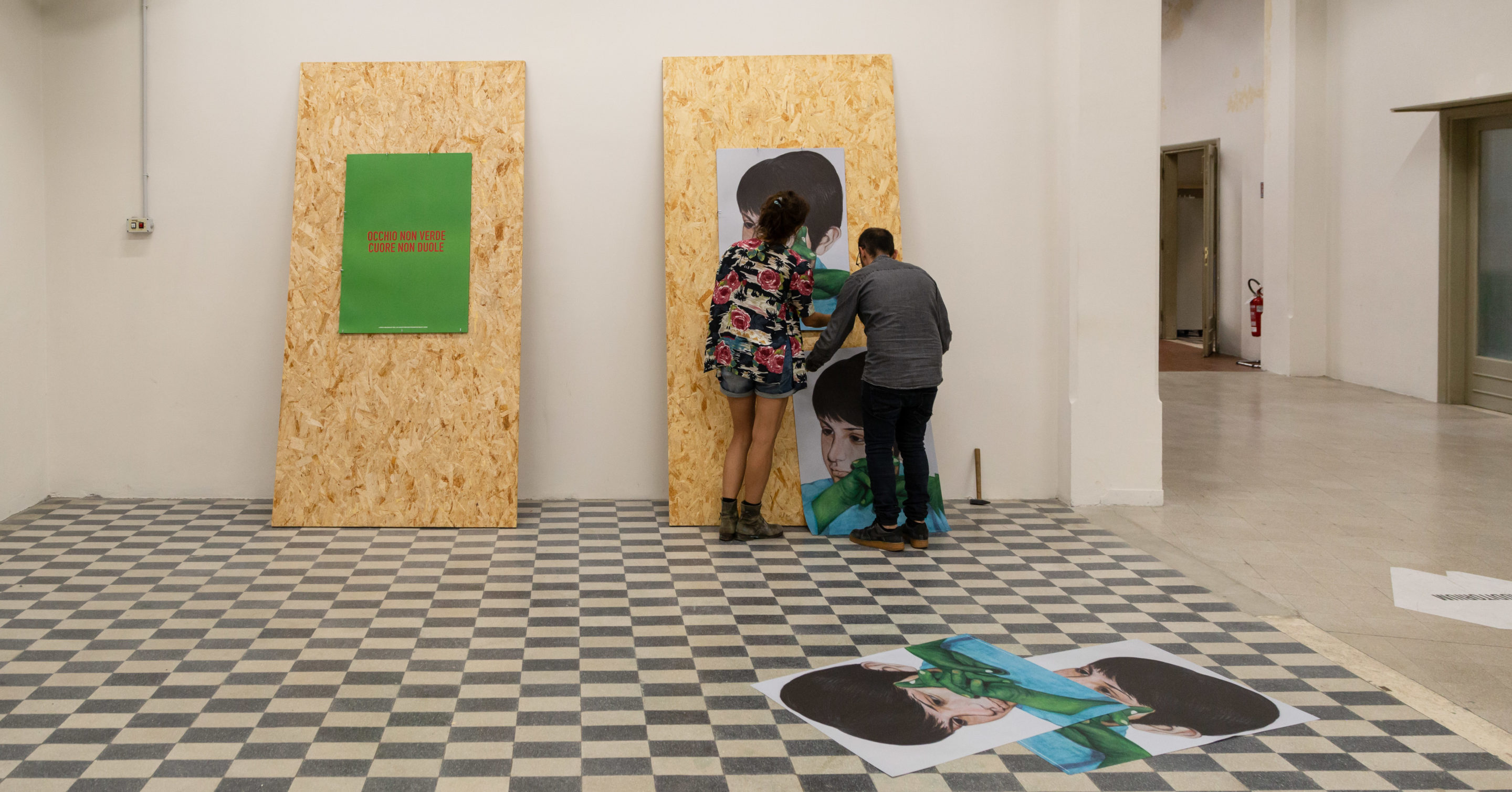
Sons of Green is the image of a child whose green hands hint at an intrinsically ecological dimension of human life. Every existence is an existence that is interposed within infinity, the universe, and matter, that consciously reproduces itself. Every time that matter ceases to be conscious in the singularity of a life, it returns to being indistinct from the rest of the universe. All return to God. If, to quote the Bible, we are born from dust and to dust we will return, this child has within itself the germ of its regeneration into something else.
the artist
occhio non verde cuore non duole
Anna Dormio
2019
stampa offset su carta, ed. 150, cm 70 x 100

The word green has been used by the artist in a playful way. Taking the famous saying “occhio non vede cuore non duole” (what the eyes don’t see, the heart doesn’t grieve over), she has substituted the word vede (see) for the word verde (green), using the complimentary colours of red and green. The annoyance provoked by this chromatic combination creates a visual short-circuit, between what is known, such as the traditional knowledge conveyed by the proverb, and what is induced by the chromatic contrast.
the artist
untitled
giulia poppi
2019
stampa offset su carta, ed. 150, cm 100 x 70

A series of juxtaposed images. In the background, you can see the type of graffiti that can be found in the area around a hospital in the Modena Apennines. A primitive and rudimentary legacy, this graffiti is filtered through the pixels of a screen, suggestively combining the analogue and the digital. In the foreground, out of focus, a cherub holds out a raised fist, a green fist that expresses a gesture of rebellion against the state of things, and an approach to dealing with them. With this poster the artist brings together two different eras and attitudes within the same frame, which search for harmony through the tension: a harmony of the past, with the reciprocal influences of humanity and nature, instead of today’s state of detachment and indifference.
the artist
future primitive
esma ilter
2019
stampa offset su carta, ed. 150, cm 70 x 100

The inspiration comes from the Garden of Earthly Delights by Hieronymous Bosch, taking an image from the triptych’s central panel. Even if the landscape of this panel looks as if it wants to represent the material world, we can’t say that this is the case. This garden is a place where a large number of human beings, linked to nature in a primitive way, are engaged in a multiplicity of activities. In the detail that the artist selected, a group of men are playing a game that reminisces on the primordial. Reinterpreting the colour green to give it ecological, artistic and rationalist intentions, Future Primitive is a manifesto that questions, through the representation of an ‘ecological society’, existence itself as well as primordial life.
the artist
untitled
Bekhbataar Enkhtur
2019
stampa offset su carta, ed. 150, cm 70 x 100

The starting point of the poster is represented by a series of photos that shows different examples of cave paintings that have been defaced, overwritten, or tagged over time. Attracted by the overlapping of the figure of the creator with that of the destructor, intrinsic to the act of vandalism, he thought about his own past design, which depicts a fox, and wrote over it. In this way the artist presents the same dynamic of creation and destruction and invites visitors to take part, giving them the opportunity to vandalise his artwork.
the artist
SAVETHEDAY
Negar Sh
2019
stampa offset su carta, ed. 150, cm 70 x 100

The manifesto is an interactive work, which can be viewed from many different perspectives. A ball is hung at the centre of an image. Either above or below it is a hole through which it could pass or has already passed, changing its direction. SAVETHDAY is nothing but the visualisation of a choice, an invitation to dwell on the instant that precedes it and on the responsibility that comes with it. Choosing to take one or other direction means doing something for the planet, which is slowly changing colour.
the artist